Difference between revisions of "User talk:Mastupuchu"
Mastupuchu (Talk | contribs) (→Getting your cards to display at the same size) |
Mastupuchu (Talk | contribs) m (→Getting your cards to display at the same size) |
||
| Line 48: | Line 48: | ||
== Getting your cards to display at the same size == | == Getting your cards to display at the same size == | ||
| − | <p>If you browse through many people's selling/collection pages, you'll notice that the card sizes change size, depending on which ★ you're currently looking at. E.g. compare a | + | <p>If you browse through many people's selling/collection pages, you'll notice that the card sizes change size, depending on which ★ you're currently looking at. E.g. compare a 4★ tab to a 10★ tab and you'll see what I mean.</p> |
<p>Example of mismatched sizes:</p> | <p>Example of mismatched sizes:</p> | ||
| Line 74: | Line 74: | ||
<p><code>File:</code> --> This will link to the card picture. It's always going to be the unit name (and/or plus star and/or version number), followed by "_card.jpg".<br /> | <p><code>File:</code> --> This will link to the card picture. It's always going to be the unit name (and/or plus star and/or version number), followed by "_card.jpg".<br /> | ||
| − | <code>link=</code> --> This will link to the card itself. Same deal, unit name (and/or plus star and/or version number).<br /> | + | <code>link=</code> --> This will link to the card itself. Same deal, unit name (and/or plus star count and/or version number).<br /> |
<code>250px</code> --> This magic number will tell the site, what size to display the art at. Personally, 250-300 is [http://www.youtube.com/watch?v=CCVdQ8xXBfk big enough]</p> | <code>250px</code> --> This magic number will tell the site, what size to display the art at. Personally, 250-300 is [http://www.youtube.com/watch?v=CCVdQ8xXBfk big enough]</p> | ||
Revision as of 21:48, 26 January 2018
Alright so, gonna put small guides here so people know how to code, and how to do it right.
Any questions about my cards or anything else, take it to LINE or kik. If you flood this page, I will haunt you.
Contents |
Displaying Unit or Monster info in those fancy tables
For Units:
{{Unit_header_s}}
{{Unit_GroupName|9★}}
{{Unit_Row|Ironblood}}
|} <!-- This is important to close off the table, otherwise you end up with a mess -->
It will look like this:
| Unit | ★ | Type | C | S | R | |
|
|
Skill | Source | |
|---|---|---|---|---|---|---|---|---|---|---|---|
| 9★ | |||||||||||

|
Ironblood |
9 | Melee | 30 | C | 130 | 261,108 | 217,626 | 201,430 | Poison, Iron Wall |
Simply Elementary Group Rank Reward + Recruitment 1st - 15th 30 units awarded |
For Monsters:
{{Monster_Header}}
{{Unit_GroupName|9★}}
{{Monster_Row|Ironblood_m}}
|} <!-- This is important to close off the table, otherwise you end up with a mess -->
It will look like this:
| Monster | ★ | Type | Speed | |
|
|
Base HP (Max HP) |
Source | |||
|---|---|---|---|---|---|---|---|---|---|---|---|
| 9★ | |||||||||||

|
Ironblood_m |
9 | |
C | A | A | A | 70,000 (1,310,470) |
Simply Elementary Group Rank Reward 1st - 15th 30 units awarded | ||
Getting your cards to display at the same size
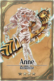
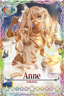
If you browse through many people's selling/collection pages, you'll notice that the card sizes change size, depending on which ★ you're currently looking at. E.g. compare a 4★ tab to a 10★ tab and you'll see what I mean.
Example of mismatched sizes:
My workaround to that is a little more complex, but the results are much more worth it. (Obligatory IMO :P)
You'll want to write your cards this way:
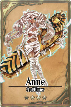
[[File:Anne_card.jpg|link=Anne|250px]]
File: --> This will link to the card picture. It's always going to be the unit name (and/or plus star and/or version number), followed by "_card.jpg".
link= --> This will link to the card itself. Same deal, unit name (and/or plus star count and/or version number).
250px --> This magic number will tell the site, what size to display the art at. Personally, 250-300 is big enough
Example of matching sizes:
Hiding the Table of Contents
Cutting to the chase, put the thing below, anywhere (I really mean anywhere) on your page. Be it before your page starts, at the end, in the middle, wherever you like. It just has to be somewhere.
Prepare... to have your minds blown...
__NOTOC__
That's it.


